Understanding CSS Clamp for Responsive Design
Clamp() is a CSS function that allows for fluidity between a minimum and maximum size. What does this mean for responsive design? It means that you can use less media queries and breakpoints to set the size of fonts, line heights and containers.
How it works
You can use the clamp() function within any size attribute.
clamp(min, val, max)min: The minimum size.
val: The preferred value when it starts adjusting between the the minimum and maximum sizes.
max: The maximum size.
Let’s break it down…
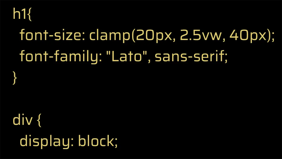
Below is a visual example of how clamp() works. To get the full effect of the fluid font resizing click here for the CodePen. I used pixels so that you can get tangible numbers, but you can use any unit of measurement such as rem, em, vw, vh, and even math functions with calc().
What’s happening here:
- The preferred font size is always being calculated at 2.5vw.
- When the heading reaches minimum size of 20px is reached, the font size stays at 20px.
- When the heading reaches the maximum size of 60px, the font size stops adjusting.
While setting the minimum and maximum sizes are a no-brainer, reaching a preferred size can be a little tricky. Luckily there are online calculators that assist in taking out the guesswork. Shout-out to those big-brains out there who help us developers with these tools!
Best Practices
For truly fluid sizing, make your val (middle) parameter adjustable to the screen or container size. Setting the preferred value in px or rem will not allow for fluid adjustments. It will stay at the preferred size.
Ask yourself if clamp() is really necessary. For font sizing, clamp is a very useful function. However, you can probably achieve the same results using min-size, max-size, setting a percentage, or viewport width size.
CSS clamp is best used for larger typography. Body copy should remain readable on devices. Using clamp() on body copy is unnecessary since the font size does not need to be variable as the screen adjusts. If your body copy is excessively large on desktops, your best bet is to use media queries and breakpoints to set your font sizes.
The Future of Front-End Development
CSS Clamp is compatible with all modern desktop browsers and most standard device browsers. It is an excellent time-saving function for responsive design. More CSS functions and queries are being developed so that we can rely less on media queries and javascript to make websites beautiful and functional on all screen sizes.
Leave a Reply